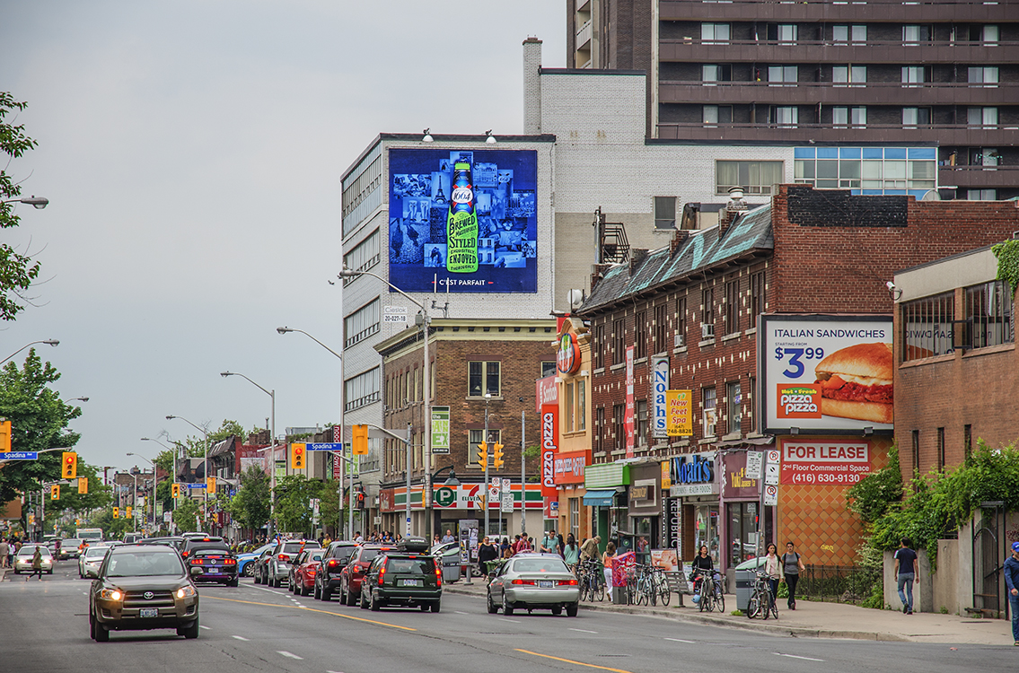
Here’s a recent campaign I worked on with John St. in Toronto for Kronenbourg 1664. I had the pleasure of working with Nellie Kim and Chris Hirsch on developing these outdoor ads that were posted throughout Toronto.
i am not a fan of gradients usually..when illustrate i always whitened flat colors..but i do however respect when a gradient is done right! I really dig this ad! gut gemacht!
Some more beautiful beer #art by Erik Marinovich. #lettering #beer http://t.co/AjUCb9ZFPi http://t.co/iTa84StR4s
1664 http://t.co/xddhcIRwU9 @ErikMarinovich http://t.co/54BnezCuNU
Looks really good. But is this a finished project? There is a typo in the French copy. Savoir-faire, not Savior-faire…
[Tipografia] 1664 http://t.co/Dupe40cKzR via @friendsoftype
i am not a fan of gradients usually..when illustrate i always whitened flat colors..but i do however respect when a gradient is done right! I really dig this ad! gut gemacht!
I like kronenbourg, I like this campaign.