The following fellows are responsible for creating the majority of the work on this site and its daily operations:
- Aaron Carámbula—Carámbula
- Erik Marinovich—Erik Marinovich
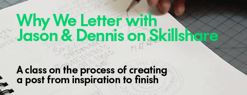
- Dennis Payongayong
- Jason Wong—Jason Wong
Contact
Please contact us if you’re also a friend of type or if you need a friend-for-hire: hello@friendsoftype.com or find us on twitter @friendsoftype.
The Basics
Friends of Type features original typographic design and lettering – fresh visual content – practically every day, by the four primary contributors. Posts are meant to log ideas, express ourselves, and inspire each other and our readers. The last week of every month we feature a guest designer, someone we admire and think will elevate our work and the site through their contribution. This is a sketchbook, an archive, a dialogue. The posts are sketches and ideas on visualized language; a collaborative habit born out of the realtime interactions that made us friends in the first place.
On Type & Lettering
Type and lettering are like squares and rectangles; the first is always the other but the other is not always the first. We know, as trained and academic designers, that type is traditionally defined as a system of interchangeable linguistic characters in a given medium, typography is the manipulation and application of those characters, and that lettering is the unique visual rendering of a piece of language, often with limited consideration for extrapolated context and extended use. Unfortunately we find the distinction a bit daft in the era where both meet in the exact same media; handwriting is digitized into font formats and fonts are programmed to achieve randomization and contextual alternates to simulate handwriting. In fact history shows that that the line has been blurred since inception with unique woodblock words, lead ligatures for optic fittings, blurring of photostet type for emotive effect, hand-traced Helvetica, and tweaked vector outlines. Bringhurst says it best in his foreward to the typographic bible, The Elements of Typographic Style:
Typography is the craft of endowing human language with a durable visual form, and thus with an independent existence. Its heartwood is calligraphy – the dance, on a tiny stage, of the living, speaking hand – and its roots reach into living soil, though its branches may be hung each year with new machines. So long as the root lives, typography remains a source of true delight, true knowledge, true surprise.
Not all of what we post is set type, nor is it all hand rendered one-offs. It is however inspired by one and could become other. We are, in the end, friends of type, not necessarily purveyors of type. Anyway, Friends of Lettering isn’t a very catchy URL.
History
The four of us have worked together at various institutions and in various roles, recognizing in each other a shared interest in quality design and, in particular, in well crafted type and lettering, but with unique perspectives and talents towards achieving that standard. In September of 2009 at 7pm EST Erik sent Aaron a sketch. Aaron said, “You should post that!” To which Erik replied, “Where?” So we joked about some names, Aaron bought a domain, designed and built a site, and there you go. 8 hours later (excluding dinner), at about 4am EST and 1am PST, Friends of Type launched.