 33
33

R is for….
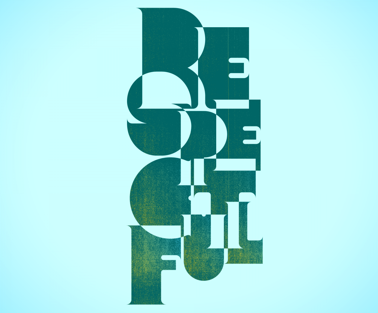
(self) Rejected art opting for something slightly more legible for a type mural at PS189x in the Bronx. Below is the final we submitted along with others that took part in the project….

Ben Peterson, an early supporter of Friends of Type, asked us to contribute to a project he was working on together with The Cornerstone Academy of Social Action to bring lettering murals to the lunch room of PS189x. The murals represent the school’s core values of C.A.R.E.S. – Considerate / Accountable / Respectful / Empowered / Successful.

The other words were created by Nicole Killian “Considerate”, Mari Suh “Accountable”, Pablo Medina and Makiko Higashi “Empowered”, and Meg Paradise “Successful”.
