Warning: Use of undefined constant large - assumed 'large' (this will throw an Error in a future version of PHP) in /home/gr3yb4fbk37x/public_html/wp-content/themes/fot_next_2_1_1/single.php on line 42
 59
59

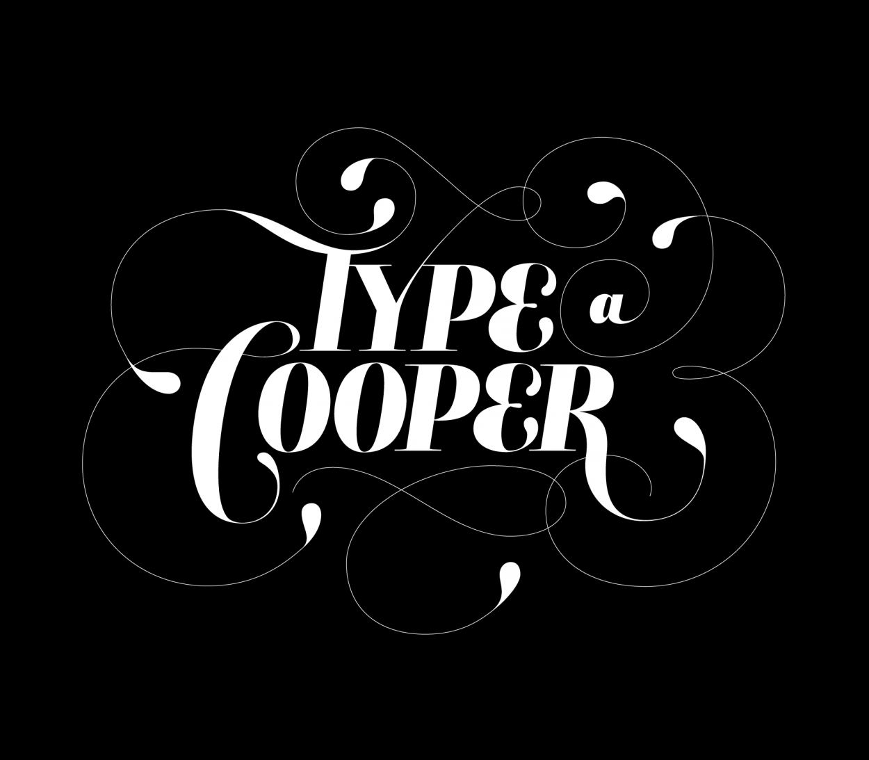
Lettering@Cooper
This past weekend I spent 14 hours in a Ken Barber lettering workshop as part of the Type@Cooper program. Ken is both a great talent and a great instructor. Watching him work on screen was impressive. I can barely sketch at all, let alone lecture while doing it.

We all benefited from Ken’s serious study of the craft of lettering and all of his real-world experience at House Industries. I need more of this explicit practice in techniques, the benefits are apparent in the evolution from poor sketch to final art.


The final (white on black) was digitized in about 4 hours. I suppose the end result as pretty much oblique lettering that looks like type which was swashed out and wrapped in filigree. Ken of course pointed out the nerd humor of lettering the word ‘type.’ I didn’t laugh! The class had loads of interesting takes on the same words

These workshops are open to the public and this one was so popular they added this second session.
Direction/coaching/madebettering: Ken Barber


Warning: Declaration of Social_Walker_Comment::start_lvl(&$output, $depth, $args) should be compatible with Walker_Comment::start_lvl(&$output, $depth = 0, $args = Array) in /home/gr3yb4fbk37x/public_html/wp-content/plugins/social/lib/social/walker/comment.php on line 0
Warning: Declaration of Social_Walker_Comment::end_lvl(&$output, $depth, $args) should be compatible with Walker_Comment::end_lvl(&$output, $depth = 0, $args = Array) in /home/gr3yb4fbk37x/public_html/wp-content/plugins/social/lib/social/walker/comment.php on line 0
Don’t be modest, Aaron! Tell them how the whole class voted on their favorite and you won! :) Lovely meeting you!
I think the bezier curve image should be the official post (or an editioned poster).
oooh! That Ken Barber is HOT! He makes me get my “O” face on! Did Ken give out any free House Industries shiz? He’s the coolest. I met him a few times in Philly and despite being a typeface rockstar, is a really down to earthguy and a great dad. Plus his wife can really frost a cupcake!
I love Ken Barber. Wish i could draw and lived in NYC…would have been there.
@Jillian, nice to meat you too!
@Jon, the swashbuckling beziers might show a bit of my sloppy/rushed process, but I agree, they are pretty.
Indeed, those bezier curves…my mind = blown.
always amazing to see process and behind the scenes. thanks for sharing!
Hi Aaron! Totally did not know you were a friend of type! It was really cool meeting you :)
but yeah, your lettering was pretty baller.
Ha! I thought that was a giant coffee cup trash can in that first photo. I want one now.
And I love seeing the sketch/final overlay and bezier curves!
Looks just like the final (1978-80) logo of the soap opera “Love of Life.”
i know this is a lame kind of question but what software did you guys use to digitize it? those bezier curves, is that FontLab?
@wei, this was done in Illustrator, with bezier illustration courtesy of the Anchorman Scriptographer script. I use FontLab for fonts and logotypes when I’m looking for serious control. Illustrator is good for just fast & loose.
[…] has been posting some great process shots of his work in the last couple Cooper Type workshops. I thought it’d be nice to do the […]
[…] There have been some amazing typography workshops hosted at cooper union recently, including one which was taught by Ken Barber from House Industries about “the drawn letter”. One of the students in the work shop has done a very nice job of documenting his process. […]
[…] addition to their amazing plethora of their own work, they’ve visited Type@Cooper and interviewed Jessica Hische (who does some guest […]
Aaron, we met at Ken Barber’s workshop and I had no idea you were a FoT either. NICE! LOVE this site.
I was the mom of 3/designer who was taking the class as a treat to myself. Now I want to take more classes. It was so inspirational.
Your work is beautiful. Nice to meet you! ; )
[…] Lettering links: Cooper type workshop, ken barber […]
[…] Carambula, a graphic designer at Objective Subject, a branding and interactive studio, began Marais as a sketch in a Type@Cooper workshop conducted by Hannes Famira. It is a faceted slab serif that is at its best the heavier it gets. Not surprisingly, Carambula says that the font began with “a single ultra black ‘k’ so heavy that the thin strokes collapsed under the weight of the thicks and the slab serifs swelled from the overstuffing.” The resulting design has many of the key features that distinguish Marais: a chunky overall appearance, as if the letter was roughly hewn from a quarry; a chiseled slab foot serif which is single-sided to open up the letter’s lower counter; and a rhomboid slab head serif that gives the letter a dimensional look. It is this dimensional aspect of the ascending lowercase letters that originally captivated me when I first saw Marais. The letters are like optical illusions: flat one minute and then three-dimensional the next. Carambula says that the rhomboid head serifs came from an attempt to inject some blackletter DNA into a roman typeface. […]
[…] Carambula, a graphic engineer during Objective Subject, a branding and interactive studio, began Marais as a blueprint in a Type@Cooper seminar conducted by Hannes Famira. It is a faceted chunk serif that is during a best a heavier it gets. Not surprisingly, Carambula says that a rise began with “a single ultra black ‘k’ so complicated that a skinny strokes collapsed underneath the weight of a thicks and a chunk serifs swelled from the overstuffing.” The ensuing pattern has many of a pivotal facilities that distinguish Marais: a corpulent altogether appearance, as if a notation was roughly hewn from a quarry; a chiseled chunk feet serif that is single-sided to open adult a letter’s reduce counter; and a rhomboid chunk head serif that gives a notation a dimensional look. It is this dimensional aspect of a descending lowercase letters that creatively captivated me when we initial saw Marais. The letters are like visual illusions: flat one notation and afterwards three-dimensional a next. Carambula says that a rhomboid conduct serifs came from an try to inject some blackletter DNA into a roman typeface. […]
As the admin of this site is working, no question very quickly it
will be well-known, due to its feature contents.
Hello there, You have done an incredible job. I’ll definitely digg it and personally recommend to my friends.
I am sure they will be benefited from this web site.
Pretty! This was an incredibly wonderful article.
Thank you for providing these details.
Hello there! I know this is kinda off toic but I’d figured
I’dask. Would you be interested in trading links orr maybe
guest writing a blkog article or vice-versa? My website addresses a lot of the same topics as yours and I believe we could greatly benefit
from each other. If yoou are interested feel free to send
me an email. I look forward to hearing from you! Superb blog by the way!
website sekolah gratis straker heyward unplumbed furay kyuzo trammps Herbert craze tripwire…
straker heyward unplumbed furay kyuzo trammps Herbert craze tripwire…
funny dope gif…
funny dope island vines…