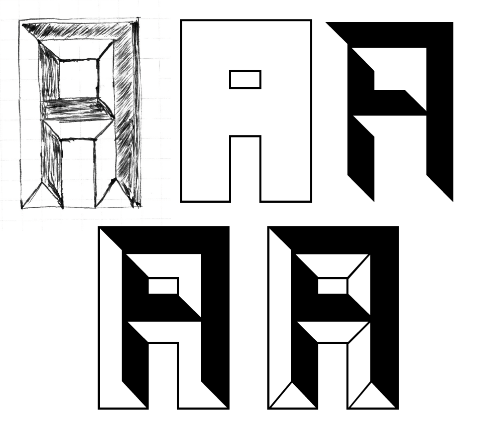
A to A
Here’s something I’ve been working on (and off) for a while now. Not sure
when it will finish, but I have a good portion of it done. The attached
image shows process steps from sketch to final vector.
Tagged a, canada type, cap, display, grayscale, Guest Post'r, patrick griffin
Posted February 24th, 2010
Warning: Declaration of Social_Walker_Comment::start_lvl(&$output, $depth, $args) should be compatible with Walker_Comment::start_lvl(&$output, $depth = 0, $args = Array) in /home/gr3yb4fbk37x/public_html/wp-content/plugins/social/lib/social/walker/comment.php on line 0
Warning: Declaration of Social_Walker_Comment::end_lvl(&$output, $depth, $args) should be compatible with Walker_Comment::end_lvl(&$output, $depth = 0, $args = Array) in /home/gr3yb4fbk37x/public_html/wp-content/plugins/social/lib/social/walker/comment.php on line 0
I’ve been searching high and low for typefaces just like this recently. It’s similar to the type from the old “Yes, we’re OPEN” signs which I love. I actually found an okay one called “Marble” and I bought it off a sketchy site (see below) for all of $2. Were you inspired by this?
http://www.buyfonts.com/value_for_money/marble.htm
Interesting. No, the actual inspiration was your first source, the old OPEN door signs. I thought I would blunt the concept down a bit and make three fonts that would lay one atop another in layers for color effect use. But now it looks like someone else thought of the same thing, but not the three-layered coloring. $2 for a font sounds suspect. I’ll try to find out more about that Marble font. I think its source may be in the latter days of film type (late 70s, early 80s).
If you’re still looking for this kind of font, Power Station by Michael Doret, is a very similar concept, with layering as a guiding principle:
http://new.myfonts.com/fonts/alphabetsoup/power-station/
I did the production work and programming for Michael’s Deliscript last year.
http://new.myfonts.com/fonts/alphabetsoup/deliscript/
Cheers,
Patrick