Creatures with no DNA
Tonight in Toronto, Peter Enneson will be giving a talk about Henk Krijger’s Raffia Initialen from 1952 (see typeclub.com for details). I worked with him to digitize this set of caps from the summer of 2008 through the winter of 2009. I will be talking about my experience with these letters alongside Peter tonight. If you’re in Toronto, try to attend the talk. This is very interesting stuff.
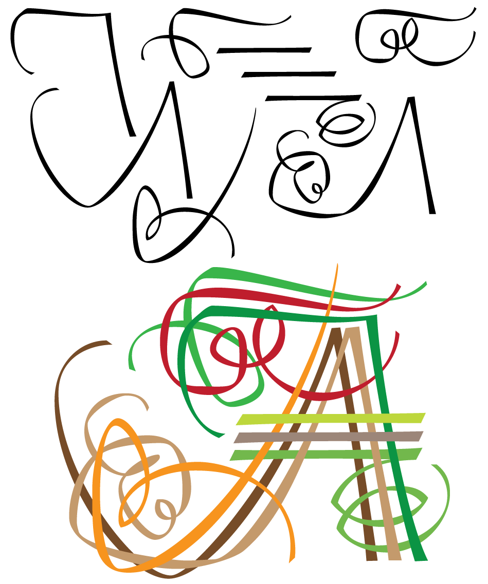
Raffia is an extremely weird set of letters. There really is no rhyme or reason that connects these letters in any way, except of course that they were all drawn with the same kind of broad pen. The concept is to this day a very unique one, and almost impossible to emulate. Each letter is really just an arrangement of what seem to be randomly drawn strands. Some letters are made from as few as three strands, some of as many as eleven. The strands themselves make no sense individually, but when you put them together in a particular way, you have beautiful and highly functional initials. The multi-cellular organism as it applies to type design.
It was very hard for me to get into Krijger’s head when I was digitizing these initials. It’s like he was a man possessed, driven only by fuzzy visions he had of letter shapes, with no plan whatsoever. The pen moves very erratically to make every one of those strands, going long here, stopping abruptly there, changing angles at the oddest spots, twisting and turning like the guy had a rubber wrist. There are 163 strands in this alphabet, and no two are the same. It’s really incredible stuff. I’ve shown these letters to many calligraphers, and the majority of them said that this was too adventurous, highly irregular, and extremely difficult to replicate or improve upon by a lettering artist today.
There’s been some prior digitizations of these initials, but they were all made from scans of old print catalogs that show inadequate sizes and are plagued with misleading ink spreads, which in turn means unclean outlines and no understanding whatsoever of how these letters were made. This new digitization was made from Krijger’s original drawings. Within the digitization of each letter, each strand still stands independently on its own in the overall arrangement (meaning the contours’ directions are overlay-ready but they are not merged), so that each initial can be turned into a colorful collage, as you see above.
Peter and I are talking about publishing this set of letters through Canada Type, so if you’re interested in it, I anticipate it to be released some time soon.
You can see the entire set of letters here.
Other related links:
– Here is an article from Eye magazine about Peter Enneson’s translation of a very important Dutch writing/type theory book by Noordijz, “The Stroke”.
– In 2003 Peter Enneson gave a presentation on Raffia. View it here.
Posted February 25th, 2010
 23
23
